

CASE STUDY · SILVAGO
We didn't grow Silvago's traffic. We tripled the revenue they got from it.
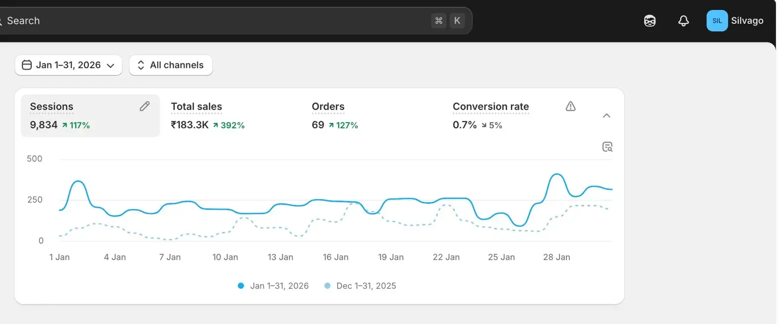
0.7% → 2.4% conversion rate in 4 weeks. Sessions stayed flat. Orders went 3.4×.
.911ab94b.png&w=3840&q=75)
The client
Silvago
Silvago is a D2C jewelry brand on Shopify, founded by Mansi Adlakha. Sells handcrafted silver jewelry.
Based in India, ships pan-India. Mansi runs the brand hands-on — managing inventory, photography, marketing, and the storefront herself.
By early 2026, the brand had a working catalog, organic momentum, and steady traffic. What it didn't have was orders coming in at the rate that traffic should have produced.
The problem
Decent traffic. Almost no conversions.
Silvago had a working Shopify store and decent traffic. What they didn't have was conversions — only 0.7% of visitors were checking out, roughly a third of what's typical for D2C jewelry.
Mansi had already tried the obvious things — swapping product images, tweaking the theme, running price tests. Nothing moved the needle. Before scaling ad spend on a site that wasn't converting, she wanted to understand why people were leaving.
Our approach
We didn't pitch a redesign.
We started by figuring out where, exactly, visitors were dropping off — and what they were trying to do when they left.
Installed Microsoft Clarity and spent a week watching session recordings. Patterns showed up fast:
- On mobile, product images stacked awkwardly. Users scrolled past Add to Cart without seeing it.
- Specs (chain length, weight, material) were buried below 4 sections of marketing copy. People wanted basics; they had to dig.
- Cart-to-checkout took 3 taps. Most users abandoned at tap 2.
- Trust signals — returns, shipping, COD — lived on a separate policies page. Nothing on the PDP told a first-time buyer they were safe to order.
Once we had the recordings, the fixes wrote themselves.
What we built
Specific deliverables. No fluff.
- Rebuilt PDP mobile-first — image gallery sized to one viewport, Add to Cart pinned to bottom of screen, key specs above the fold
- Inline trust signals on every PDP — 7-day returns, free shipping above ₹999, COD available
- Compressed cart-to-checkout to a single tap
- Cleaned up navigation — removed 3 menu items with near-zero clicks, sped up category page loads
- Set up persistent Microsoft Clarity tracking so Mansi has post-handoff visibility into user behavior
The result
Sessions stayed flat. Revenue tripled.
| Metric | Before (Jan 2026) | After (Mar 2026) | Change |
|---|---|---|---|
| Conversion rate | 0.7% | 2.4% | 3.4× lift |
| Orders | 69 | 232 | +236% |
| Revenue | ₹183.3K | ₹532.2K | +190% |
| Add-to-cart rate | baseline | +78% | — |
| Checkout completion | baseline | ~2× | — |
| Bounce rate | 71.4% | 42.9% | -28.5pp |
| Sessions | 9,834 | 9,647 | flat (-1.9%) |
Sessions stayed flat. Everything else moved. The site didn't need more traffic — it needed to convert the traffic it already had.
Want a 3.4× conversion lift like Silvago?
Book a 30-minute Shopify audit. We'll review your store, identify the biggest conversion blockers, and tell you honestly whether we're the right fit.
Book a Free Strategy Call150+ projects shipped since 2018 · Replies within one business day